Forge
The fitness chocolate with benefits, not guilt.
A vegan metabolic fitness chocolate that combines nutrition and exercise.
Project Overview
Build a brand and identity project for Forge, aimed at fitness enthusiasts who prioritize their mind, body, and soul and still enjoy treats like chocolate. The brand embodies having the best of both worlds.
Services
Identity Design & 3D Modeling
Software
Adobe Creative Cloud: Illustrator, PhotoShop, Dimensions, XD, Blender, HTML, CSS, and Javascript Library
Challenge
Create a vegan fitness chocolate brand identity with a design system that appeals to the target audience by providing supplement options that are both delicious and beneficial for overall well-being.
Solution
Creating a design system for a brand called Forge that appeals to its target audience, which is unclear whether they are health enthusiasts, athletes, or those seeking healthy snacks. The design must also differentiate Forge from any existing competitors in the market.
Conceptual Planning
The goal of the design project is to target a market of health-conscious, vegan, gym-going individuals and promote the positive health benefits and natural, organic ingredients of the vegan metabolic fitness chocolate product. The brand will align with fitness to help users optimize their workouts.
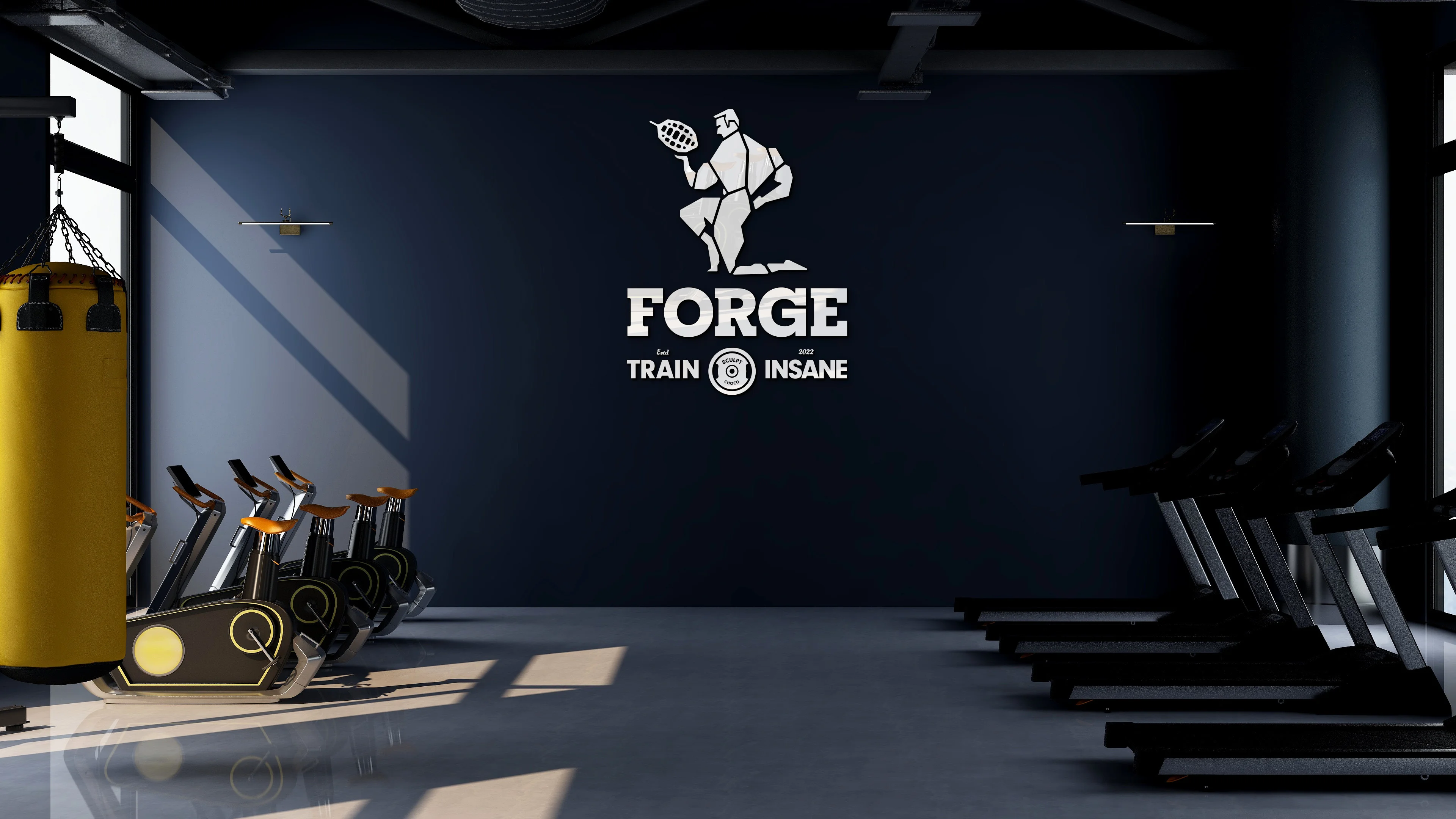
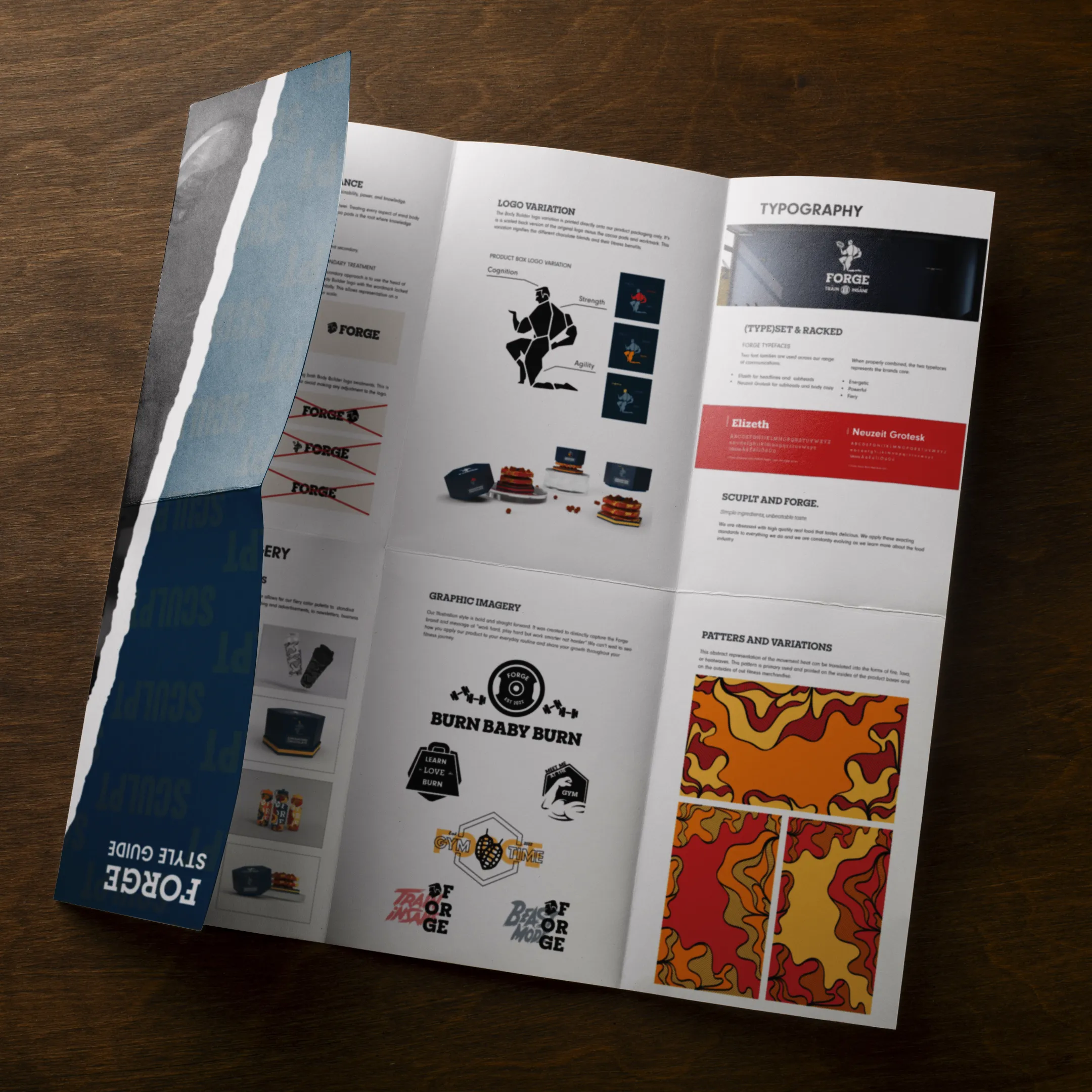
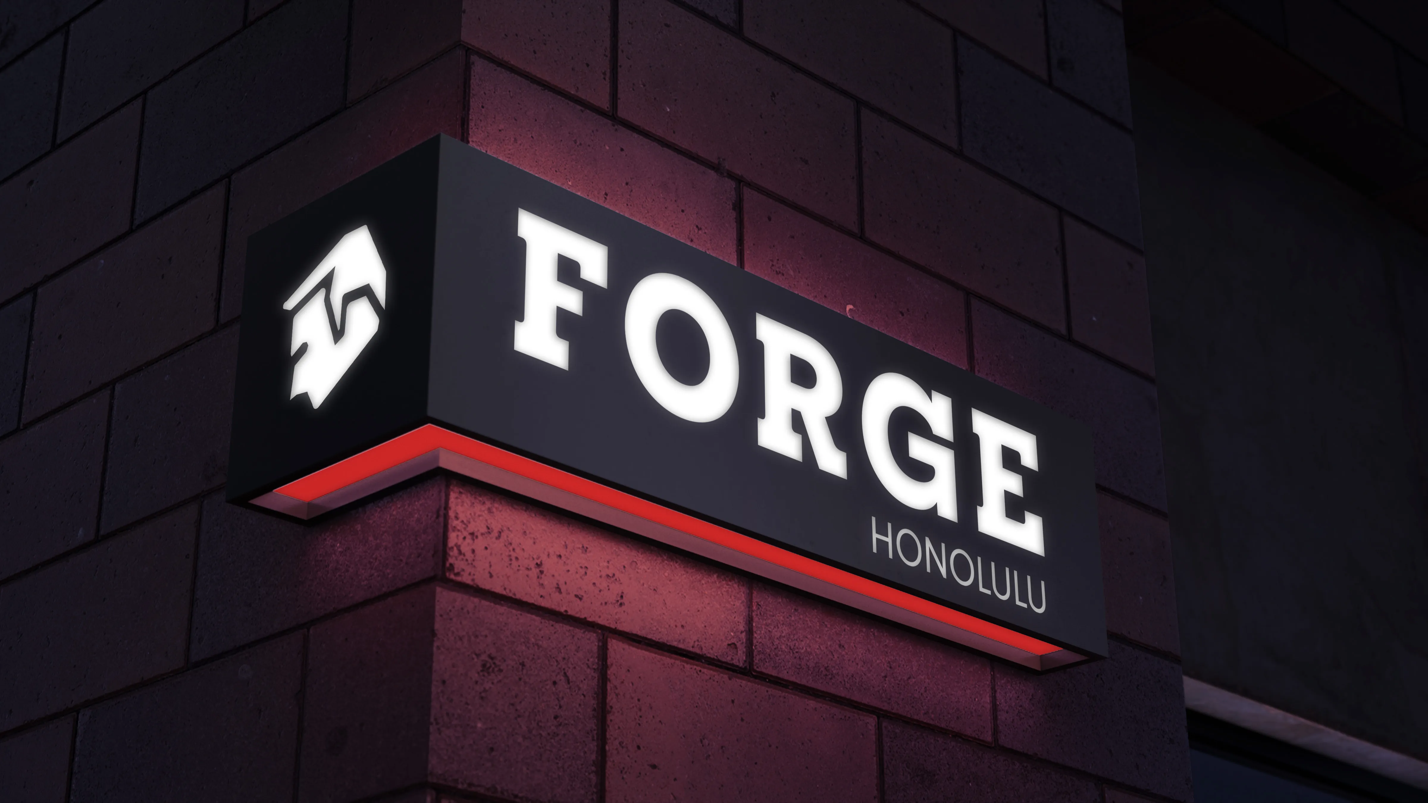
Logo
As a brand, Forge exemplifies simplicity and modernity, while communicating its health benefits and fitness-oriented lifestyle. A subtle nudge to intellectual aspiration is conveyed by the bodybuilder and cocoa pod. Forge encourages its users to always push themselves beyond their limits and to seek knowledge at the source.

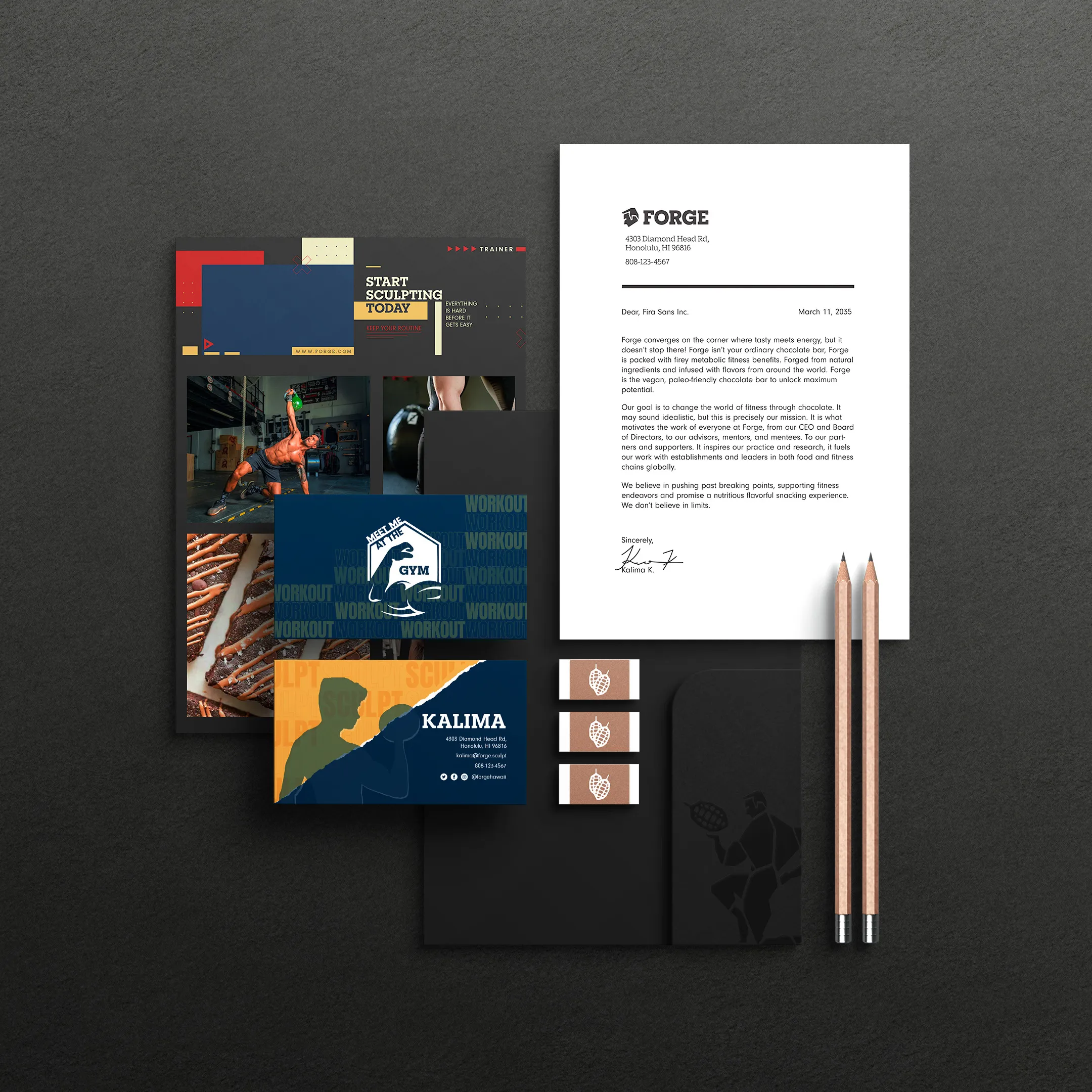
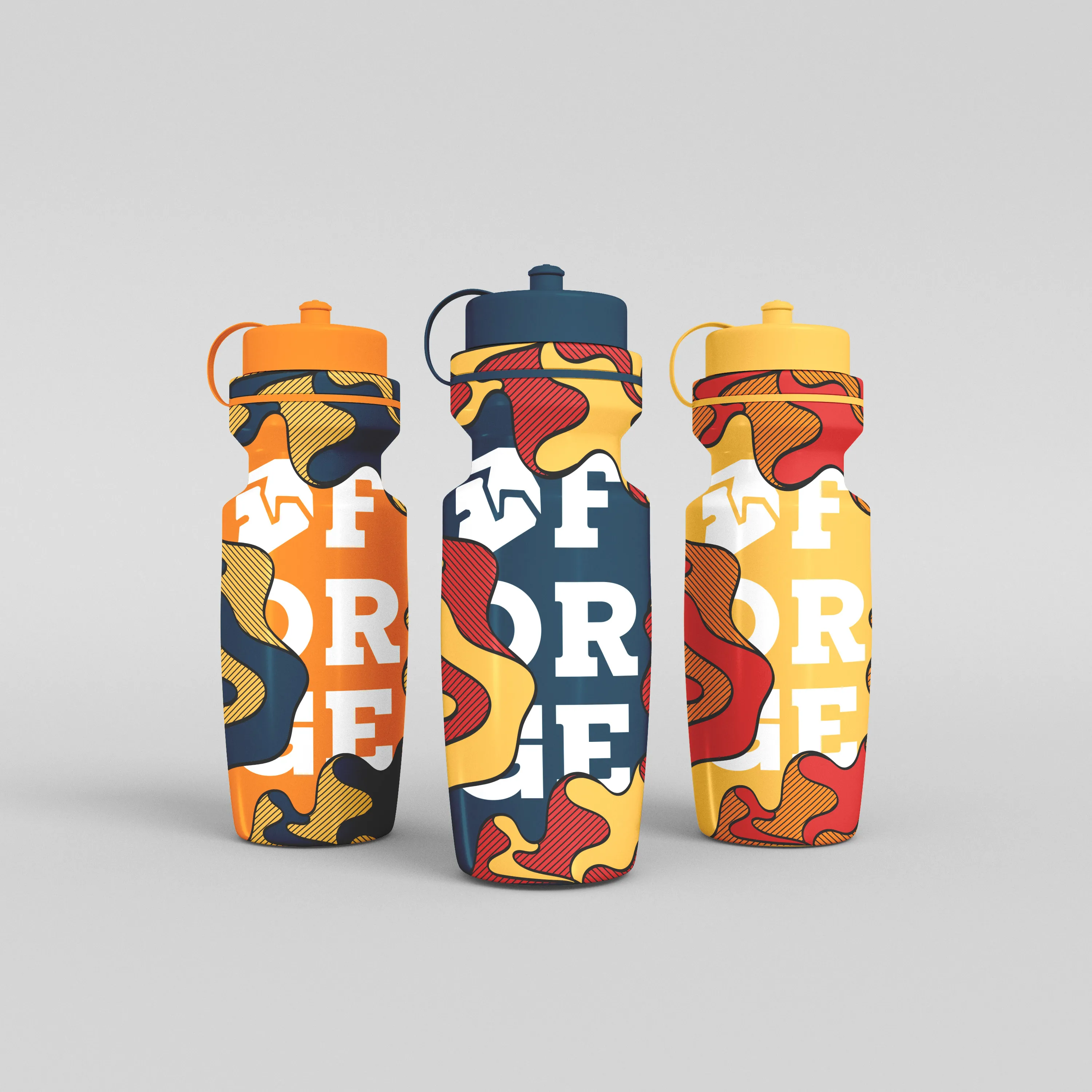
Color Palette
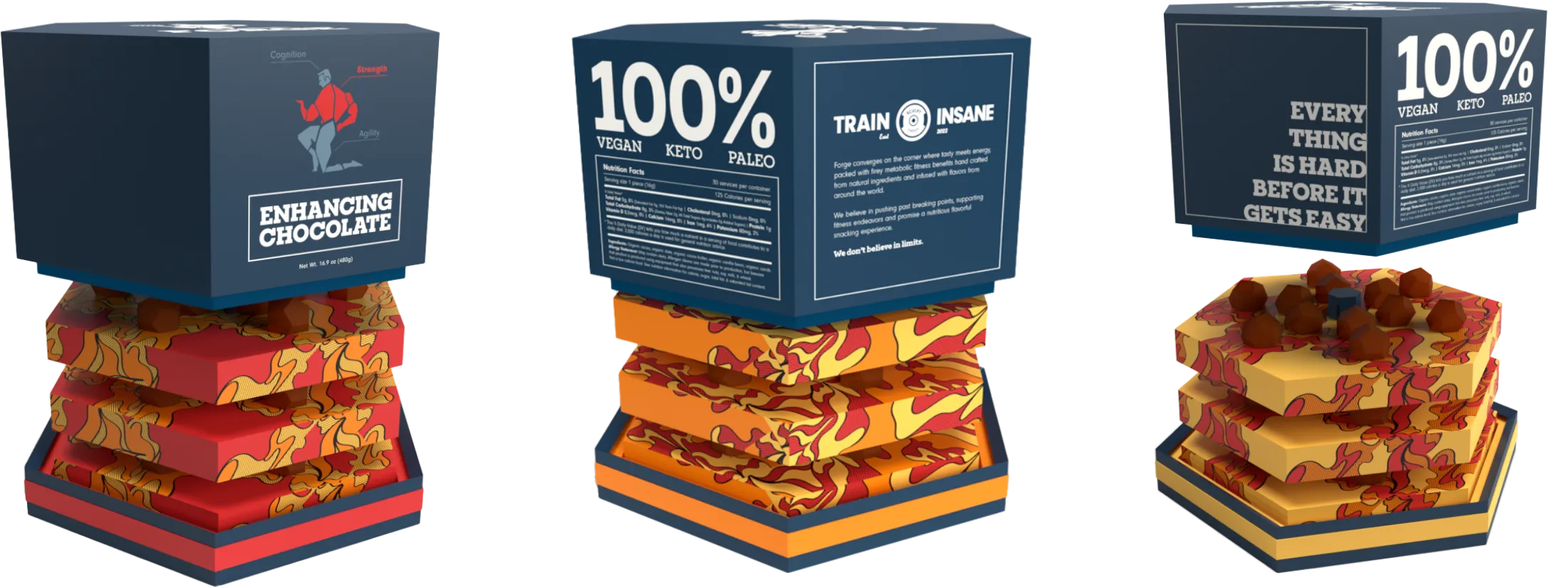
The Forge brand color palette was chosen based on the core values of the brand, which include fiery, natural, tasty, superior, energetic, powerful, and enduring. The palette features four primary colors (blue, red, orange, and yellow) and three secondary colors (black, white, and sand) to enhance the primary colors. The color combination is used throughout the entire brand, including marketing, packaging, and product design.

Typography
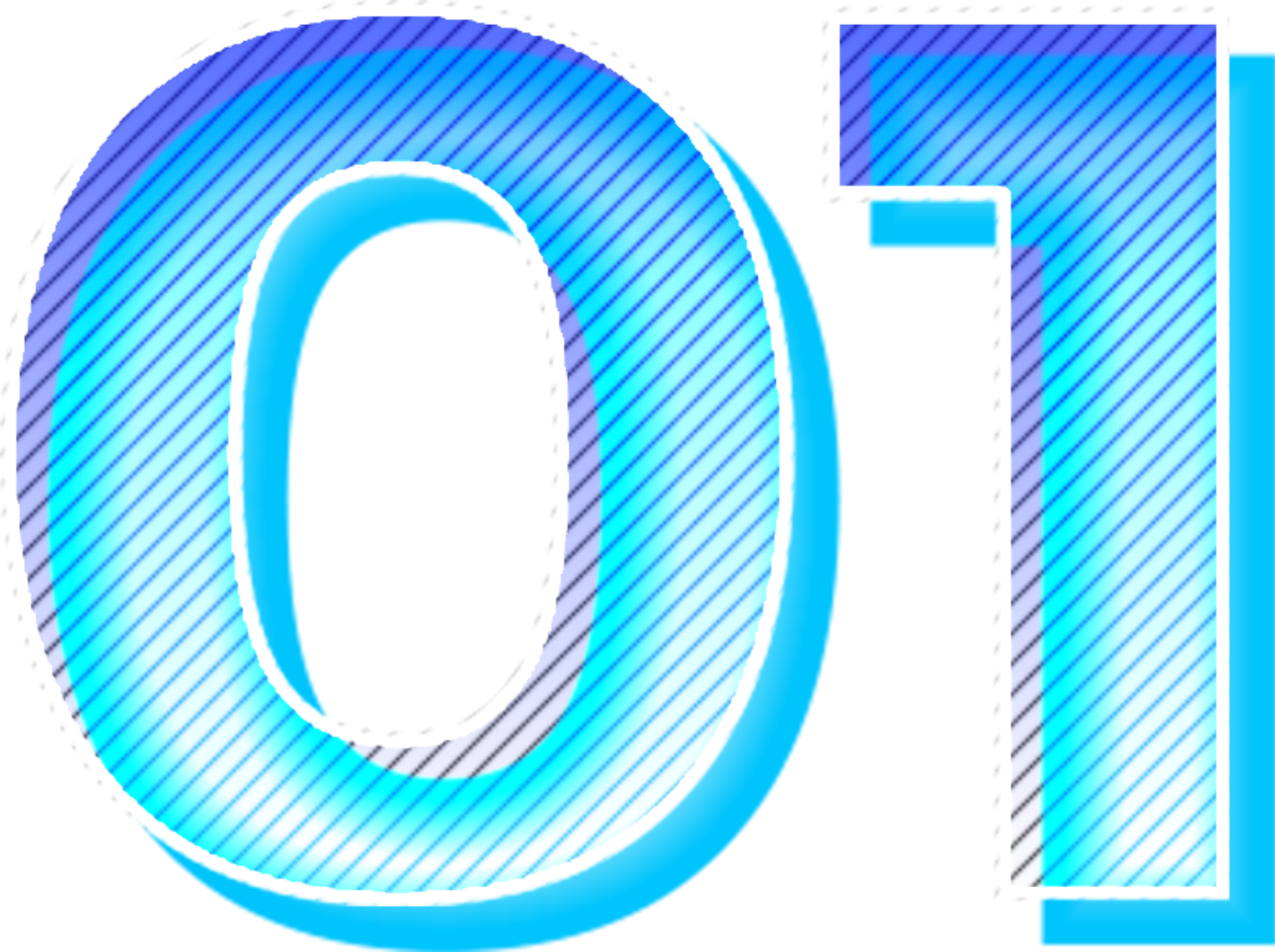
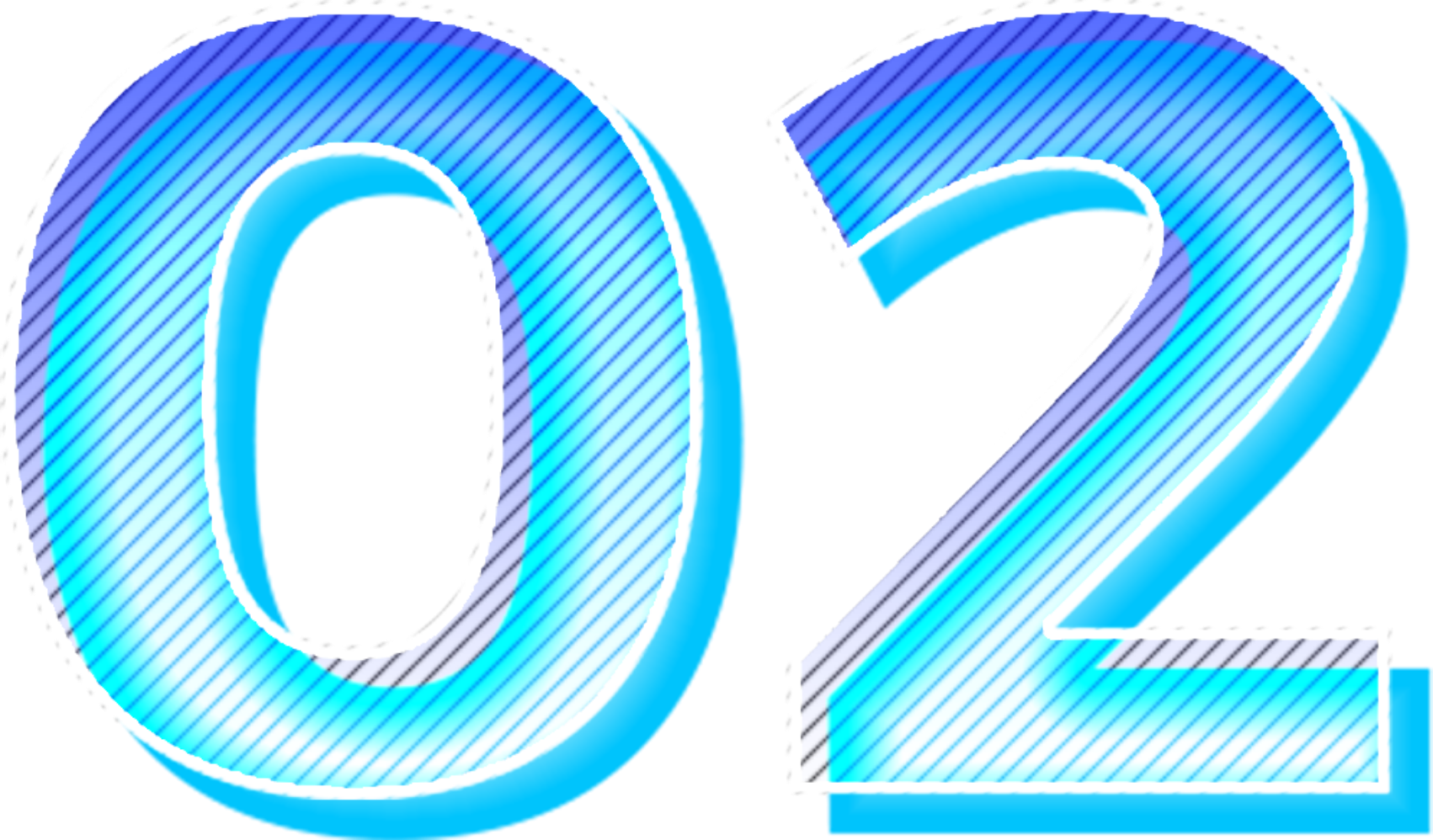
The typography of Forge needs to communicate strength, endurance, and a natural tone to a specific like minded audience. Spirit, characterization, and radiance were prioritized while creating the typographic style of Forge.
The font choices for the fitness brand identity are Elizeth, a slab serif typeface with a solid and bold structure, and Neuzeit Grotesk, a geometric sans-serif typeface with round and elastic letter forms that add a dynamic sense of movement.

Graphics/Icons
Customized typographic illustrations are utilized to spread the brands message bringing awareness to the active lives of gym fanatics everywhere. The illustrations are inspired by common phrases and sayings you would usually hear around the gym.
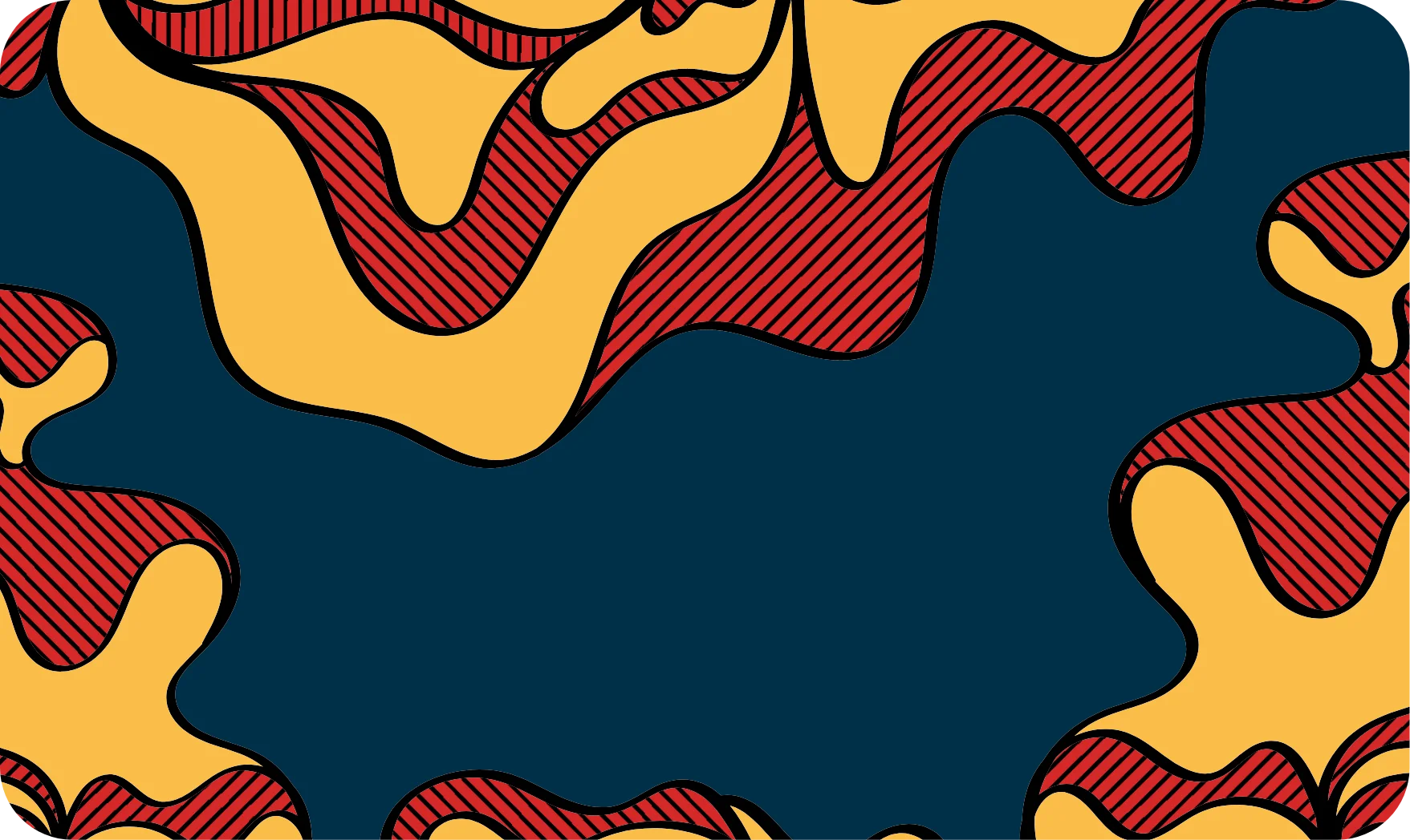
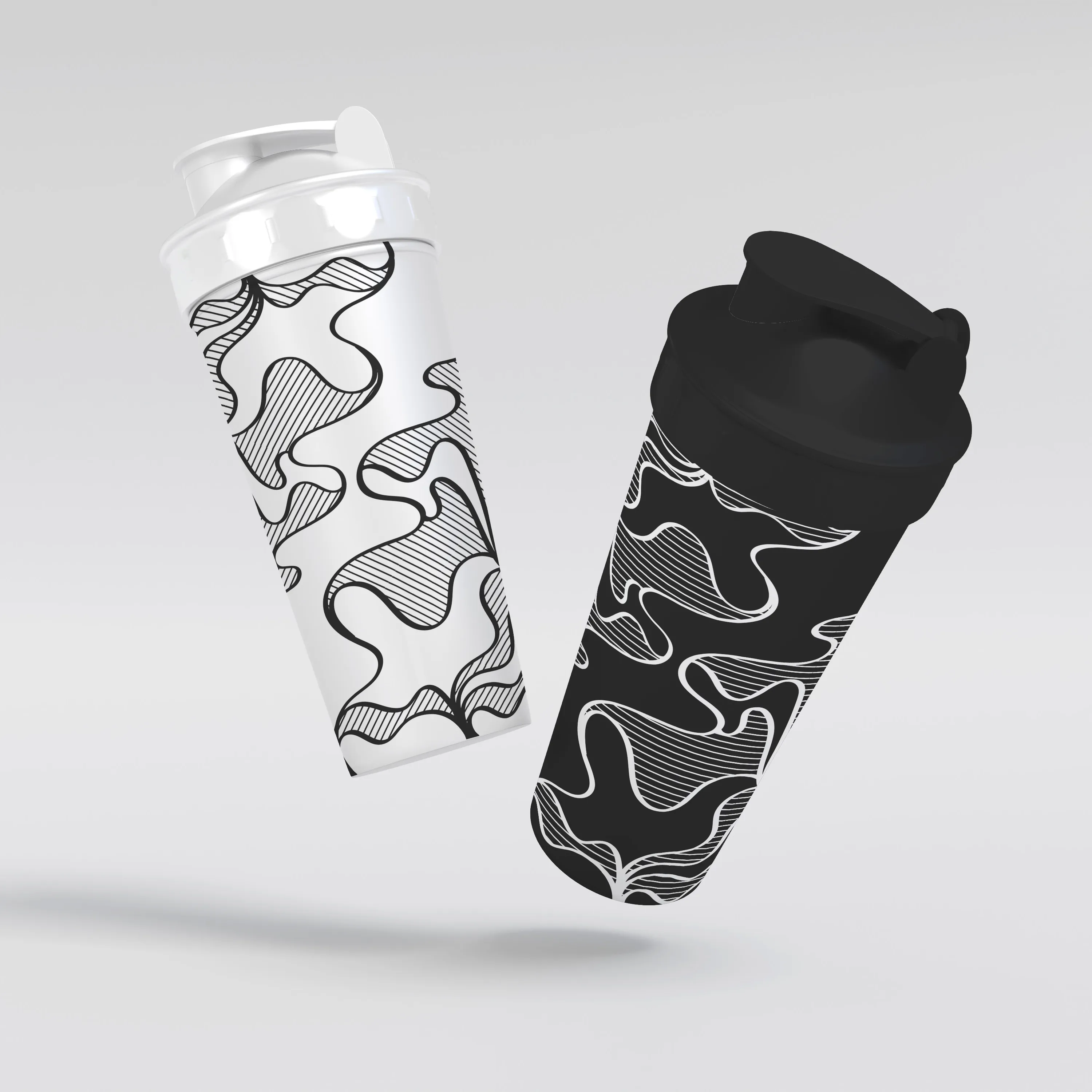
Pattern
The lava wave pattern is used to symbolize the visual effect of heat, metabolic benefits, and a heated workout session. It creates a visual sense of staying active, good vibes only, and knowing where your food comes from.
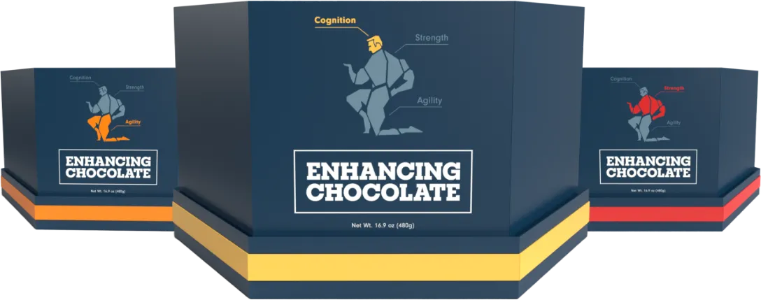
3D Graphics
The packaging design for Forge involved creating a unique design that was inspired by exercise, gym equipment, and body movements. The goal was to create a functional design that would allow users to take the product on-the-go while keeping the contents safe. The design process involved sketching and experimenting with various outcomes, which eventually led to the use of 3D software to better understand the amount of chocolate that could fit in the box and how it would be placed.
Animations
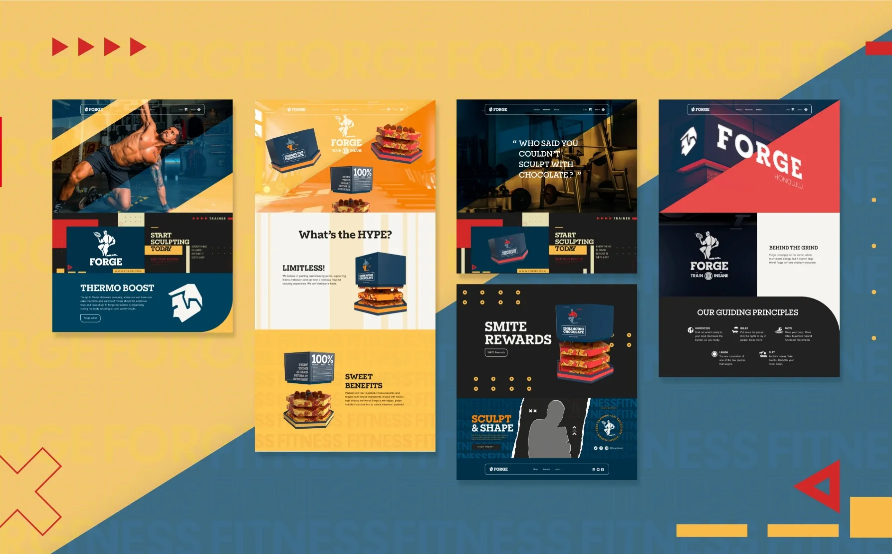
Forge leverages cutting-edge web animations to captivate audiences and promote its vegan metabolic fitness chocolate. With a focus on the health and fitness benefits of its product, Forge's dynamic animations showcase the energy and excitement of a healthy, active lifestyle. Whether used for promotional advertisements or marketing campaigns, these animations effectively communicate the brand's message and engage its target demographic.
Ready to Forge
The goal with this project was to create a safe and growing space for up-and-coming creatives while representing the heart of the brand through an engaging and friendly interface.
View Web Design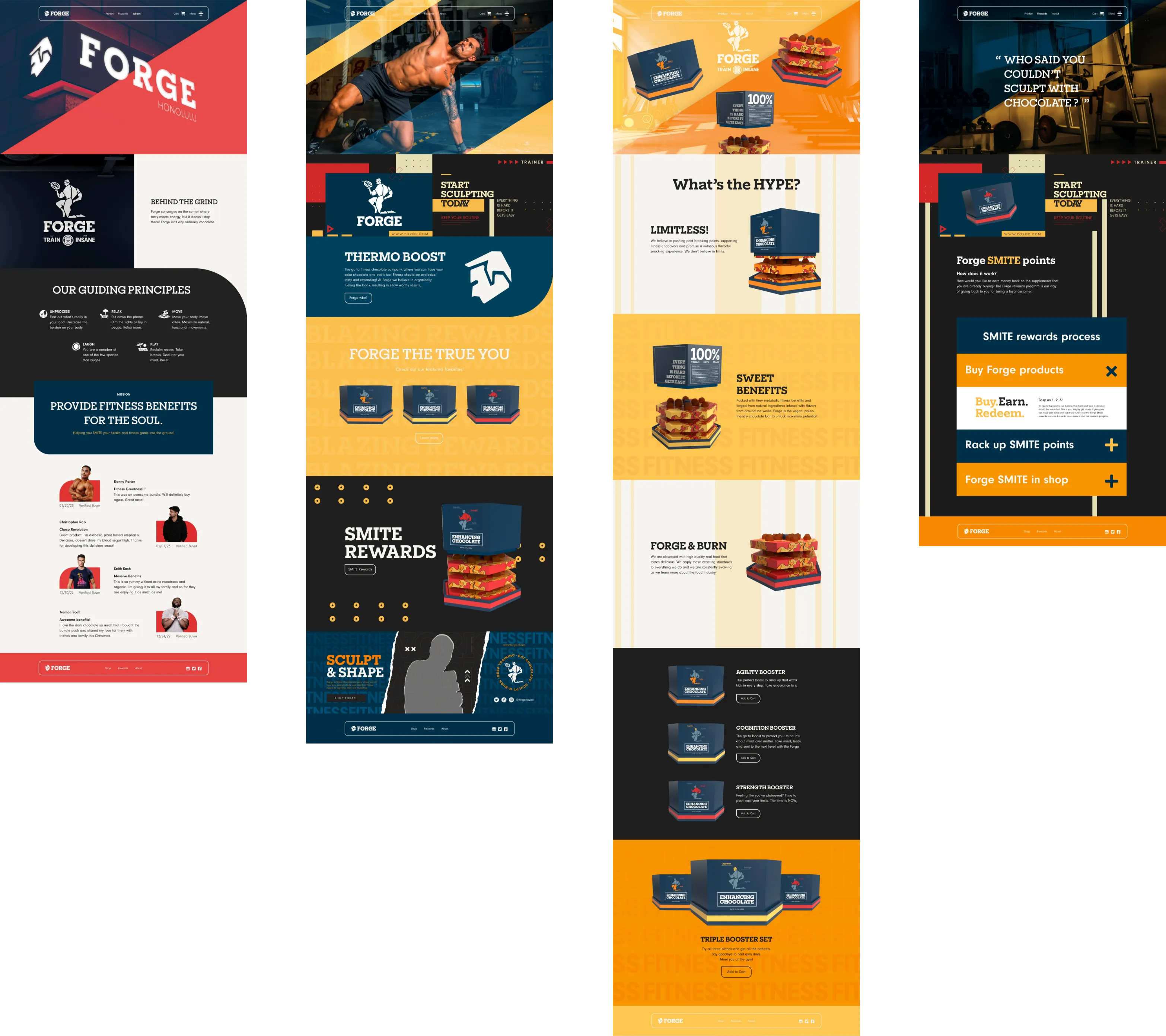
See more work
Kuaina
Identity Design, Print Design
Piko
UX/UI Design & Development, Web Design, Motion Graphic Design, Identity Design